Mapping for Beginners
Your Guide to Getting Started With
Azimap
If you have a
set of data that you’d like to place on a map for beautiful visualisation or to
help with decision-making, Azimap is for you. What’s more, you don’t need to be
an expert to use our software!
We know how
daunting Azimap can seem at first, so be sure to make your way through this
guide before getting started with Azimap…
Contents
1.
Understanding
your data and how to use it with Azimap
a.
Spatial
(or location) data
b.
Address
information
c.
A
‘live’ database
d.
No
data yet
2.
Getting
the basics right
a.
Creating
a layer
b.
Use
of layers
3.
Types
of maps you can create, and when to use them
a.
Boundary
map
b.
Choropleth
map
c.
Heatmap
d.
Picture
map
e.
Predominance
map
f.
Route
mapping
4.
Jargon-buster
a.
Attribute
b.
Buffer
c.
Dataset
d.
Digitise
e.
Feature
type, i.e. line, point or polygon
f.
Geocode
g.
Layer
h.
Polygon
i.
Spatial
i. Spatial analysis
ii. Spatial data
1.
Understanding
your data
Take a look at
your dataset before you start – this will help you determine exactly the kind
of map you can create and the best way to upload it. Common datasets that our customers usually have
include:
·
Spatial
(or location) data – this could include coordinates or longitude and latitude.
·
Address
information – this could be one or many of the following: first line of
address, postcode, county/state, town, etc.
·
A
‘live’ database – a database where location data is updated in real-time and is
typically hosted on a SQL server.
·
No
data yet – if you have nothing yet but a big idea, then no problem. Azimap will allow you to collect and input
your data directly onto a map.
Now, we’ll go
into a bit more detail about each type of dataset, how Azimap deals with it and
how to use it to create a successful map.
a)
Spatial
(or location) data
Coordinate,
or longitude and latitude data usually fall under this category.
This is the simplestr type of data to upload onto Azimap if you have it, as it requires the least
work when uploading. It’s pretty easy to just upload your data and go, though
it might need a bit of extra configuration. Read this guide on importing your data to find out how.
The best part
is, even with our free trial version,
you can upload unlimited spatial data (so long as it falls within the other
constraints of our trial version).
b)
Address
information
Meaning you
can map one or many of the following: first line of address, postcode,
county/state, town, etc.
This is pretty
self-explanatory. If you have any kind
of address information, it can be uploaded and mapped easily with Azimap. As
with your spatial data, it requires very little work to upload.
To use this
feature, you’d choose the GEOCODE ADDRESSES import option when creating your layer.
One handy
hint is, before you
upload your file, make sure that your primary field that you would like
Azimap to base your map on, is named ‘Address’. For example, if you want the postcodes in
your database to be mapped, rename your postcode field to ‘Address’.
One drawback to
the GEOCODE ADDRESSES option, is that on any plan, the max allowance is 5,000 addresses, depending on your plan. You’ll need to upgrade for more or learn to digitise your addresses yourself . It’s unusual that our customers would
reach this limit, but please bear this in mind and plan accordingly.
Read this guide on geocoding addresses to find out more.
c)
A
‘live’ database
This is a
database where location data is updated in real-time and is typically hosted on
a SQL server. (MS SQL or PostgreSQL)
This is a
little more advanced and requires your data to be hooked up to a ‘live’
database through a SQL server. Typically,
this option is only used by customers who know a lot about what they’re doing! This option is available to professional and enterprise customers.
Read this guide on linking external data to find out
more.
d)
No
data yet
If you have
nothing yet but a big idea, then no problem.
Azimap will allow you to collect your data directly onto a map.
When creating a
new layer, by selecting the ‘new layer’ option instead of one of the import
options, you’ll create a new blank layer that you can work on. In this
instance, all you’ll need is your idea and a plan for the data that you want to
capture, i.e. the ‘attributes’.
Attributes are
basically fields of data that you’ll be recording. For example, let’s say you want to map a
streetlamp inspection in your council area.
Your attributes might be:
·
Streetlamp
reference/number
·
Inspector
name
·
Light
working? Y/N
·
Details
of any damage
Read this guide on creating a new Azimap layer to find
out more.
2.
Using
layers – your first step
If you’ve never
used the Azimap technology before, you’ll probably be wondering where on earth
to start. We’ve seen the same mistakes
happening over and over with new users, so we’ve created this to help make getting
started that little bit easier.
After reading
section 1, you’ll know exactly what type of data you have, so now you need to put
that data onto a layer.
NB. Don’t
fall into the empty map trap! It is
possible to create an empty map first, but we strongly recommend starting by
importing your data/creating a new layer (and add to a map later), as there’s
very little you can do with an empty map.
1.
Creating
a layer
When you log
into Azimap, go to the DATASETS section on your main navigation bar. Press the CREATE DATASET button to enter the wizard.
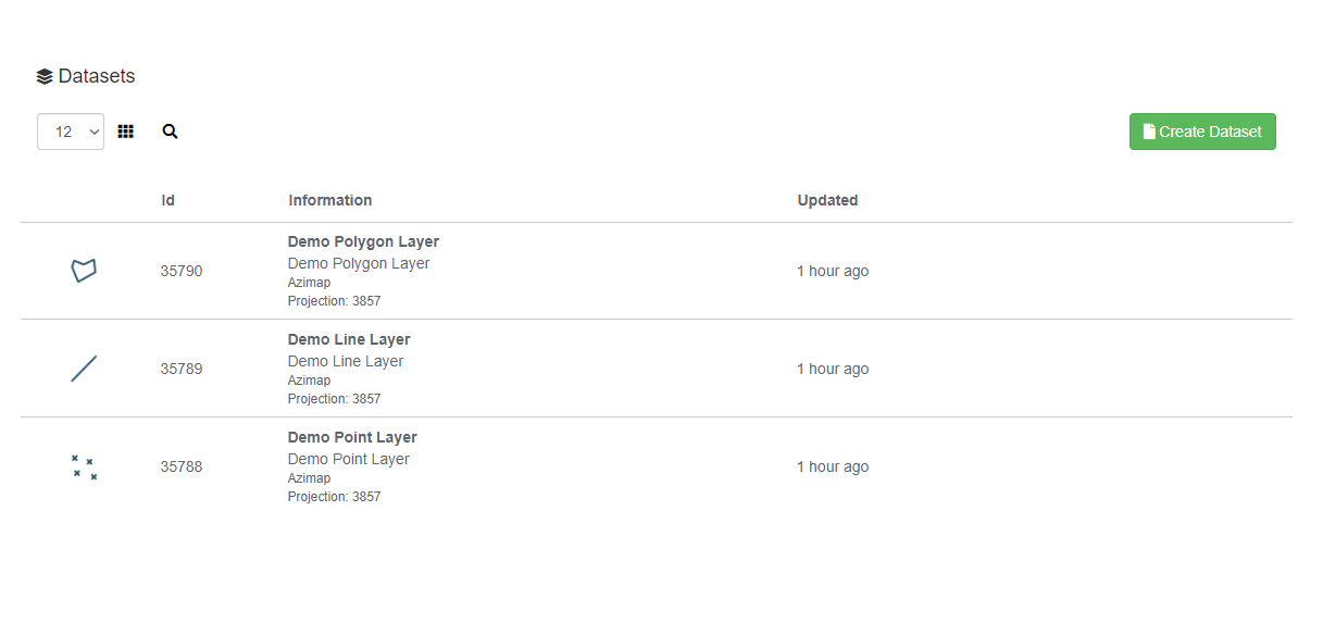
you'll get
stage 1 of the wizard:
![]()
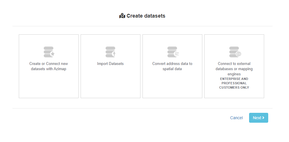
Now, remember
above when we learned about the different types of data we could import into
Azimap? We’ll now show you how to import each type.
·
Spatial
(or location) data – You’ll pick IMPORT LAYER
·
Address
information – Choose GEOCODE ADDRESSES
·
A
‘live’ database – Pick the EXTERNAL DATA option
·
No
data yet – Create a NEW LAYER
We’ve created
lots of guides to take you through the next steps for each of these options,
but hopefully you’ll end up with a new layer that you can work with! Hurrah!
2.
Using
layers
Layers are
really helpful to organise your data and can help show relationships between
your data too. Adding two or more layers
together can help you visualise and analyse your data better, spot trends,
etc. Let’s look at some examples:
Use layers
to separate different data categories
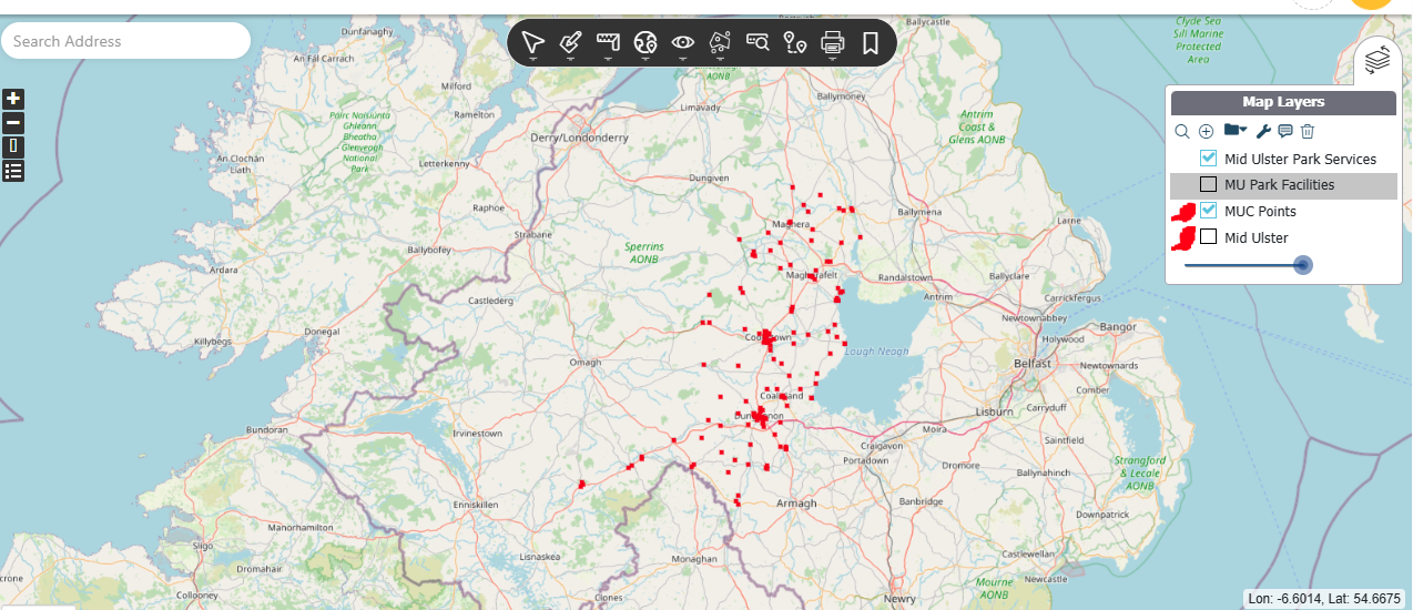
![]()
In this
example, we can see that the editor has used Azimap to map out Park Facilities and Services within Mid Ulster Council. .
All available
layers can be seen in the top right-hand corner of the map. We’ve selected the layers named ‘MUC Points’ 'Mid Ulster Park Services'.
You can turn any of these layers on or off at any point.
The number of
layers you have per map depends on the plan you have. With the Azimap free trial, you can add up to
2 layers per map.
3.
Types
of maps you can create, and when to use them
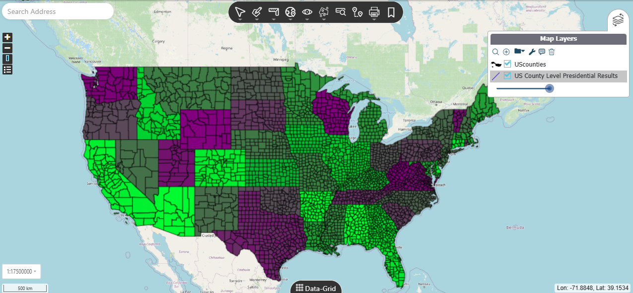
1.
Boundary
map
A boundary map
does exactly what it says on the tin – it marks boundary lines such as states,
counties, countries, etc.
This type of
map is particularly useful when you have data that you want to map within
defined boundaries.
Here’s an
example of a boundary map that we have designed. This shows the Presidential Results of 2024.
2.
Choropleth
map
Choropleth
maps show linked data as colours. They are shaded in using one colour,
where the darker shades represent high numbers and the lighter
shades represent low numbers. A choropleth map needs a key
to explain what the different shades mean.
It differs to a
heatmap because with a choropleth map the shading occurs within geographic
boundaries, whereas a heatmap doesn’t utilise boundary information.
According to
AnyChart.com, choropleth maps are appropriate for indicating differences in
land use, like the amount of recreational land or type of forest cover.
You can use a
choropleth map when your data:
1) is attached
to enumeration units (e.g., counties, provinces, countries)
2) standardized
to show rates or ratios (never use choropleth with raw data/counts)
3) is something
that can be measured anywhere in space (even 'zero' is a valid measurement).
Example
datasets appropriate for choropleths:
·
world
map of income tax rates in each country
·
number
of deaths per 500,000 in 2015, reported by USA
·
map
showing the percentage change in solved to unresolved cases from 1995 to 2015
in the UK
·
world
map of the percentage of population over 90 years old, reported by Canada
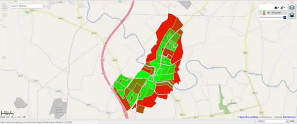
Here’s an
example of a choropleth map we designed.
Each colour represents the main industrial use for that pocket of land
in the Kilcullen area.
3.
Heatmap
According to
Wikipedia, a heat map (or heatmap) is a data visualization technique
that shows magnitude of a phenomenon as colour in two dimensions.
The variation
in colour may be by hue or intensity, giving obvious visual cues
to the reader about how the phenomenon is clustered or varies over space.
A heatmap
differs from a choropleth map because with a choropleth map the shading occurs
within geographic boundaries, whereas a heatmap doesn’t utilise boundary
information.
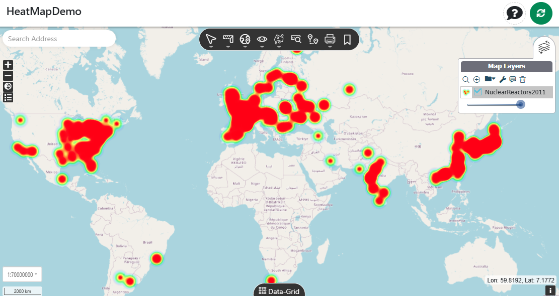
Here’s an
example of a heatmap we’ve created, showing the concentration of nuclear
reactors globally:
Other examples
of when a heatmap might be useful include when you want to visualise densities
of a certain feature, geographic points and useful for business analysis and demographics
mapping. For example:
·
Crime
density
·
Bus
lane camera density
·
Healthcare
data
·
Natural
disasters
4.
Picture
map
Using Azimap
you can create a picture map. This is
where you can attach photographs or images to a feature or point, and it will
enhance your dataset. Photo maps are good to use when you have some nice images
that you want to display, or when attaching a photo is easier than writing a
description of the object.
The map will
display a number of points, and the picture will display when you click on the
point.
Picture maps
would be useful anywhere you think images might enhance your dataset, for example:
·
Creating
a map of tourist attractions in a given area
·
Property
mapping
·
Maps
of surveys or work done
·
Etc.
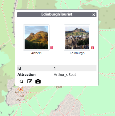
Here’s an
example of a picture map we’ve created, showing pictures of the tourist
attractions in Edinburgh:
5.
Route
map
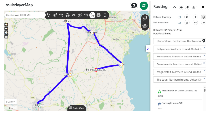
The Azimap
route mapping tool allows you to quickly create optimised travel routes.
This type of
map is useful when you need help to improve planning and reduce the time spent travelling between destinations. For
example, planning a delivery route or useful for a travelling salesperson to
plan their day.
6.
Glossary
of terms
Attribute
Attributes are basically the fields of data that
you’ll be recording. If you were
importing your data from an Excel spreadsheet, an attribute would be one
of the fields in the spreadsheet. For
example, let’s say you want to map a streetlamp inspection in your council
area. Your attributes might be:
·
Streetlamp
reference/number
·
Streetlamp
location
·
Inspector
name
·
Light
working?
·
Details
of any damage
Buffer
According to Wikipedia, a buffer in GIS
is a zone around a map feature measured in units of distance or time. A buffer
is extremely useful for proximity analysis.
In Azimap, a buffer
is an area outlined by a predetermined distance from a given point.
Dataset
A dataset is defined as a
collection of related sets of information that is composed of separate elements
but can be manipulated as a unit by a computer.
In the context of Azimap, your dataset will be your file that you
import, whether it’s Excel, Shape, CSV, TAB, KML or GeoTIFF files.
Digitise
To digitise is
to convert analogue data into digital form. If you’ve ever turned physical
papers into electronic files, switched from cassette tapes to MP3s, or moved
from old style camera film to digital photos, then you have digitised your
data. In the context of the Azimap DIGITISE
function, it allows you to place your data onto the map manually, where you
know the physical location/address.
Feature
type, i.e. line, polygon and point
In
Azimap, you can represent your data on your map with three different feature
types:
a)
Points – A point is a small single
feature that you can place on a map, such as an address/location, a small
landmark (such as a building), a shop, etc. You can use points to map
customers, locations.
b)
Lines - Represent the shape and location of
geographic objects, such as street centerlines and streams, too narrow to
depict as areas. Lines are also used to represent features that have
length but no area, such as contour lines and boundaries. Use lines to
represent data such as walking, running or driving routes; streams or rivers;
roads, etc.
c)
Polygons
– A polygon is a
many-sided area feature that represents the shape and location of homogeneous
feature types such as states/county borders, or land-use zones. Polygons can also be used to map areas
of larger buildings or landmarks like Grand Canyon or a museum building, for
example.
Geocode
According to
Wikipedia, Geocoding is the process of taking input text, such as an
address or the name of a place; and returning a latitude/longitude location on
the Earth's surface for that place. In Azimap, the GEOCODING
function allows you to input a file with no GIS location data (i.e.
longitude/latitude or coordinates) and it’ll be placed directly onto the map. It simply needs to have address information
in the file, with your main field to be mapped as labelled as ‘Address’.
NB. Note that
there are only a limited number of addresses can be geocoded with each package,
namely:
Starter – 1,000
geocodes
Standard –
2,000 geocodes
Professional –
5,000 geocodes
Enterprise –
5,000+ geocodes
With the Azimap
free trial, you are trialing the Pro package,
therefore you will get 5,000 geocodes to use for the month.
Layer
A map layer defines
how a GIS dataset is symbolised and visualised in your map view.
A layer represents geographic data, such as a particular theme
of data. Each map layer is
used to display and work with a specific GIS dataset.
Layers are a really helpful way to organise
your datasets and can help show relationships between your data too. Adding two or more layers together can
help you visualise and analyse your data better, spot trends, etc. For example, you might use layers to:
·
Separate
different data categories
·
Map
routes in relation to points or features
·
Visualise
boundaries in relation to features or points
·
Compare
the same set of data for different years
Polygon
A polygon
is defined as a plane figure with at least three straight sides and angles, and
typically five or more.
According to Wiki.gis.com, in GIS, a polygon is used to
represent the shape and location of different types of data. For example, a
lake, a city block, or a patch of vegetation, can all be represented by polygons
on a map layer. When GIS software is used to draw the outline of a lake on a
map, the resulting shape is known as a polygon. The term ‘area’ is also
used sometimes, instead of polygon.
A polygon
is one of three feature types – others are line and point – with which almost
all spatial data is depicted in GIS. Polygons, lines, and points are
invariably depicted as vector data, as opposed to raster data.
Spatial
a)
Spatial
analysis
Put
simply, spatial analysis is fancy way of saying you’re analysing your
data on a map. (Spatial referring to the space.)
Spatial
analysis is a process
of modelling, examining, and interpreting model results useful for evaluating
suitability and capability, for estimating and predicting, and for interpreting
and understanding.
For
example, in this Azimap guide, we’ve used the SPATIAL ANALYSIS
function to:
·
Locate
any nuclear power stations that share any portion of space in two intersecting
circles
·
Find any
nuclear power stations within a given radius
·
Drill
down into the specifics such as searching for any nuclear reactors that are
gas-cooled within a given radius
Other
analyses we could have run include:
·
Overlaps - Returns a result if the geometries share
space, are of the same dimension, but are not completely contained by each
other.
·
Within - Returns a result if the geometry A is
completely inside geometry B.
·
Contains - Returns a result if and only if no
points of B lie in the exterior of A, and at least one point of the interior of
B lies in the interior of A.
·
Touches - Returns a result if the geometries
have at least one point in common, but their interiors do not intersect.
·
Plus,
many more advanced analyses.
Drive time analysis - Creating
drive-time polygons could be useful for:
choosing
where to put new schools or other facilities; arranging meet up times, etc.
Read more in this guide .
Proximity searching –
Proximity search is an easy
search to run and can be used for so many purposes, for example, planning
purposes. It can tell you what lies beside a certain feature within a given
radius. e.g. Certain roadworks or building projects mightn’t be allowed to take
place within a certain distance from a school, electricity, sewer, road, etc. Read more in this guide .
b)
Spatial
data
Spatial
data, or
geospatial data, is defined by TechTarget.com as information about a
physical object that can be represented by numerical values in a geographic
coordinate system. Generally speaking, spatial data represents
the location, size and shape of an object on planet Earth such as a building,
lake, mountain or township.
In
other words, spatial data is simply the name given to the type of data
that you’ll be using when building a map.