Create
a Heat Map in 2 Easy Steps
In this guide we’ll show you how to import a zipped shape file and
create a heat map in just a few clicks.
A heat map (or heatmap) is a graphical representation of data where the individual values contained in a matrix are represented as colours. Wikipedia
Time to complete: 10 mins.
Contents
1. Getting started
1.1 Download your files
1.2 Import data and create map
2. Create
the Heatmap
2.1 Applying
heatmap rules
2.2 Applying
the heatmap style to your map
This workflow guides users through creating and configuring
datasets and maps in Azimap, including importing data, setting up map layers,
and adjusting visualization settings such as heatmaps.
1. Getting Started
1.1: Download your files
Download the required dataset from the original provider before beginning this demonstration.
Required download:
[1] Download World Nuclear Power Plant - Official Source Data
1.2. Start the dataset import
On the Datasets page, select Create dataset.
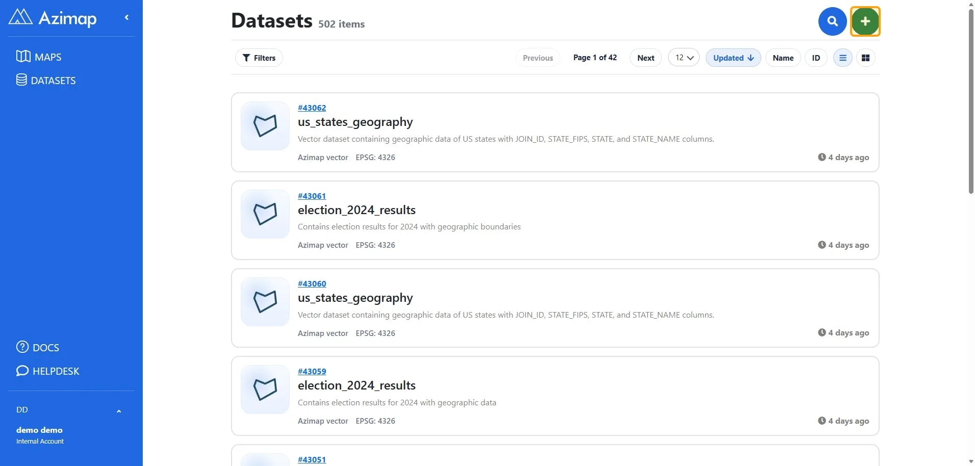
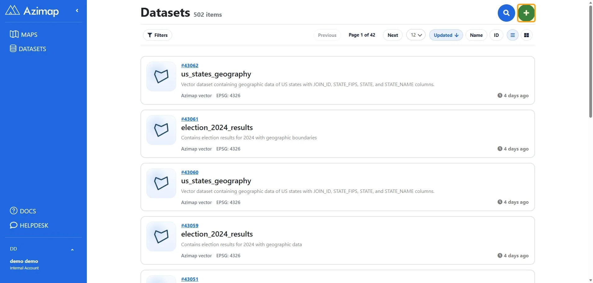
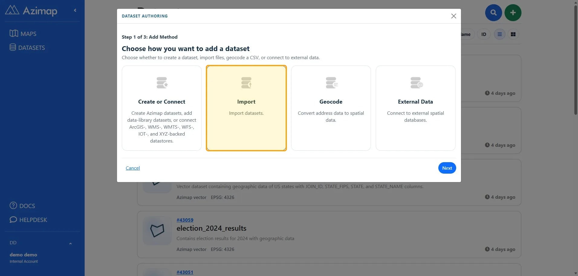
Choose Import, then select Next.
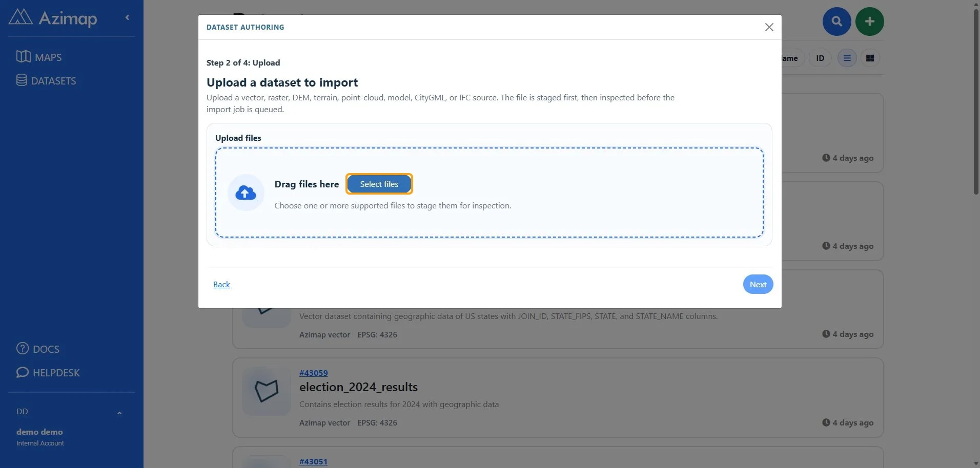
Select files, choose the dataset file, and wait for the
upload to complete.
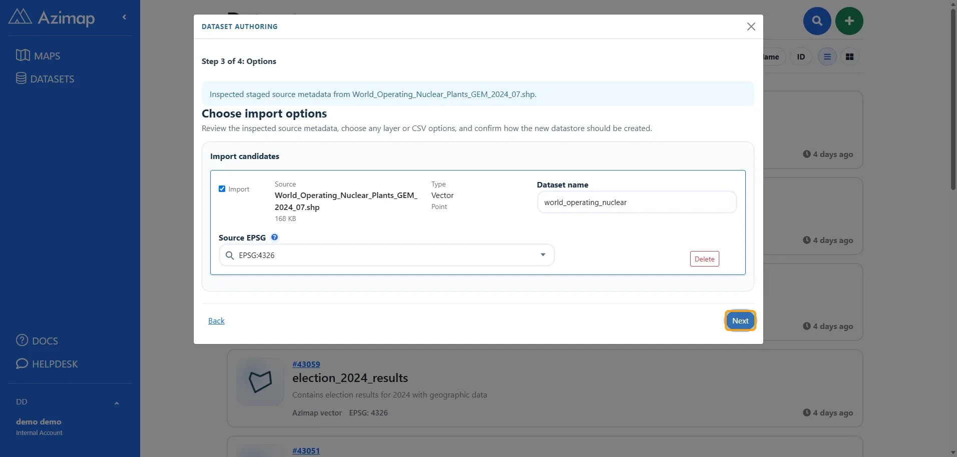
Review the import options and projection, then select Next.
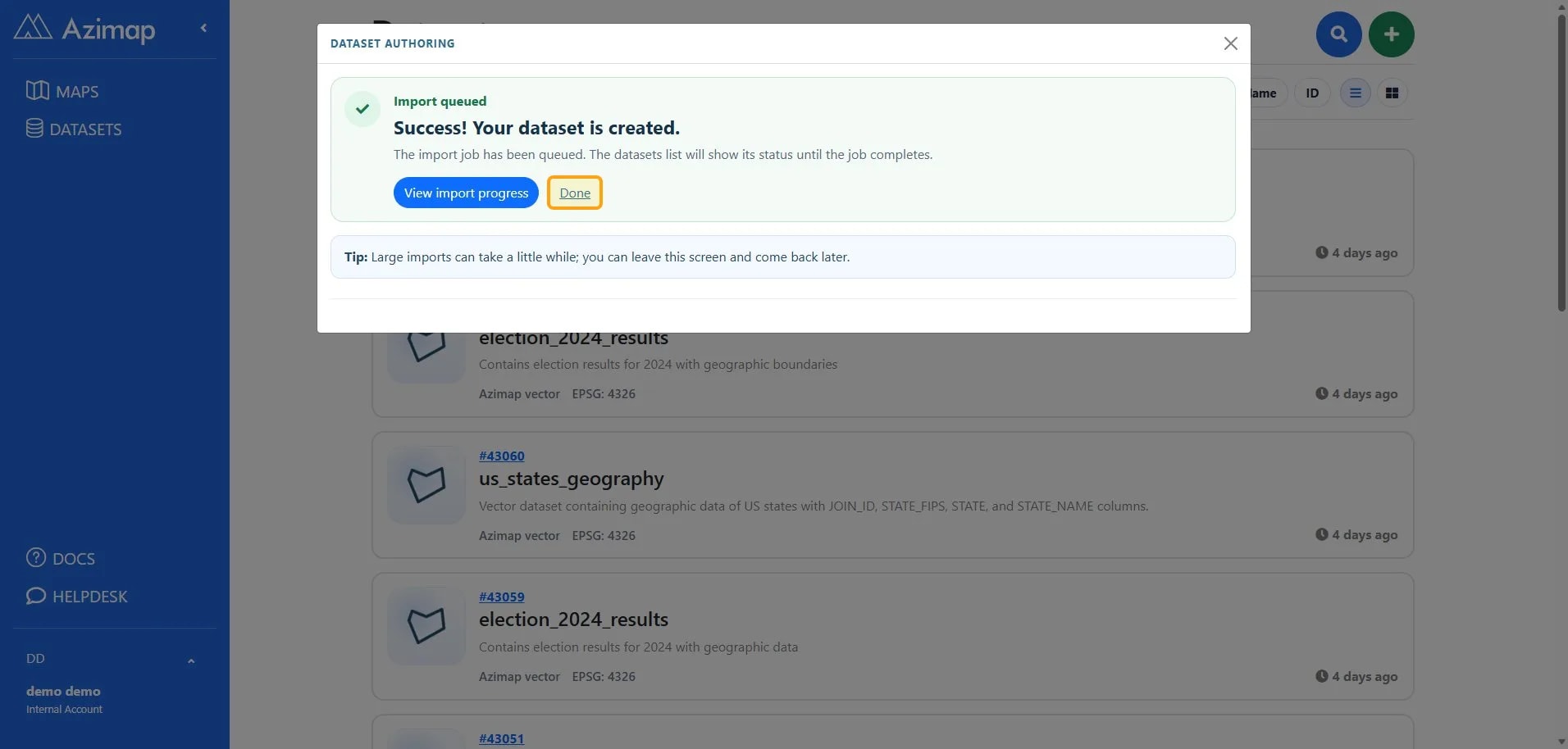
When the success message appears, select Done.
1.2: Create the map
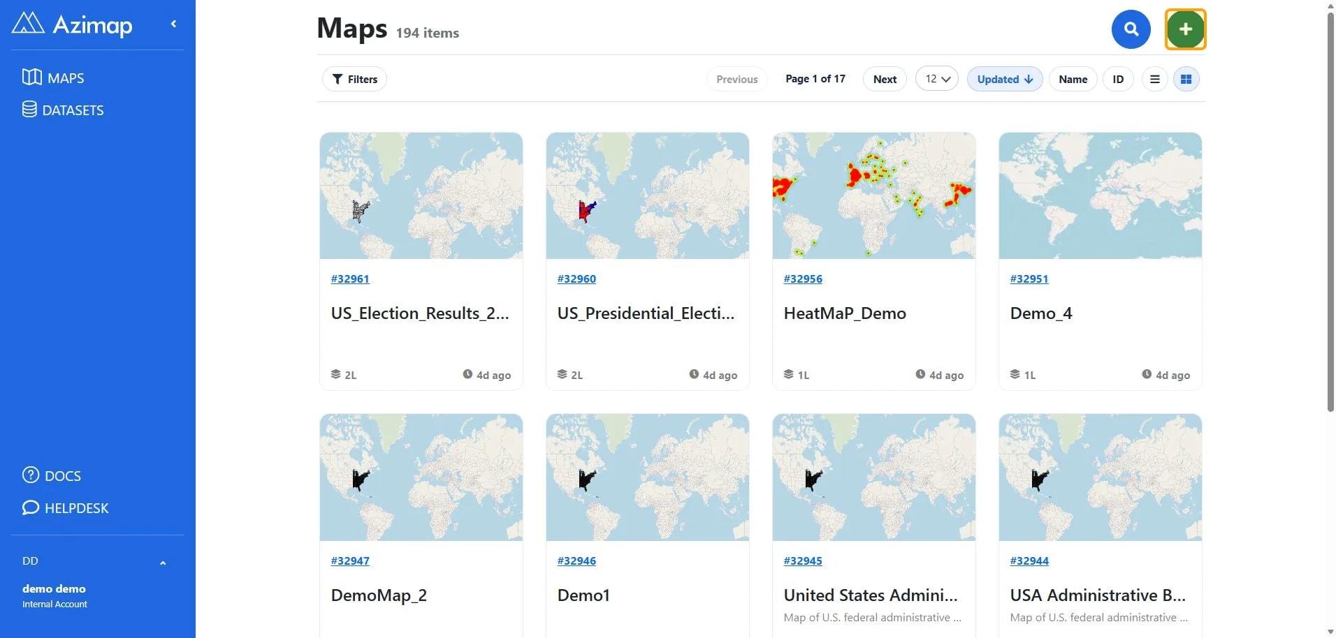
Open Maps from the left navigation, then select Create map.
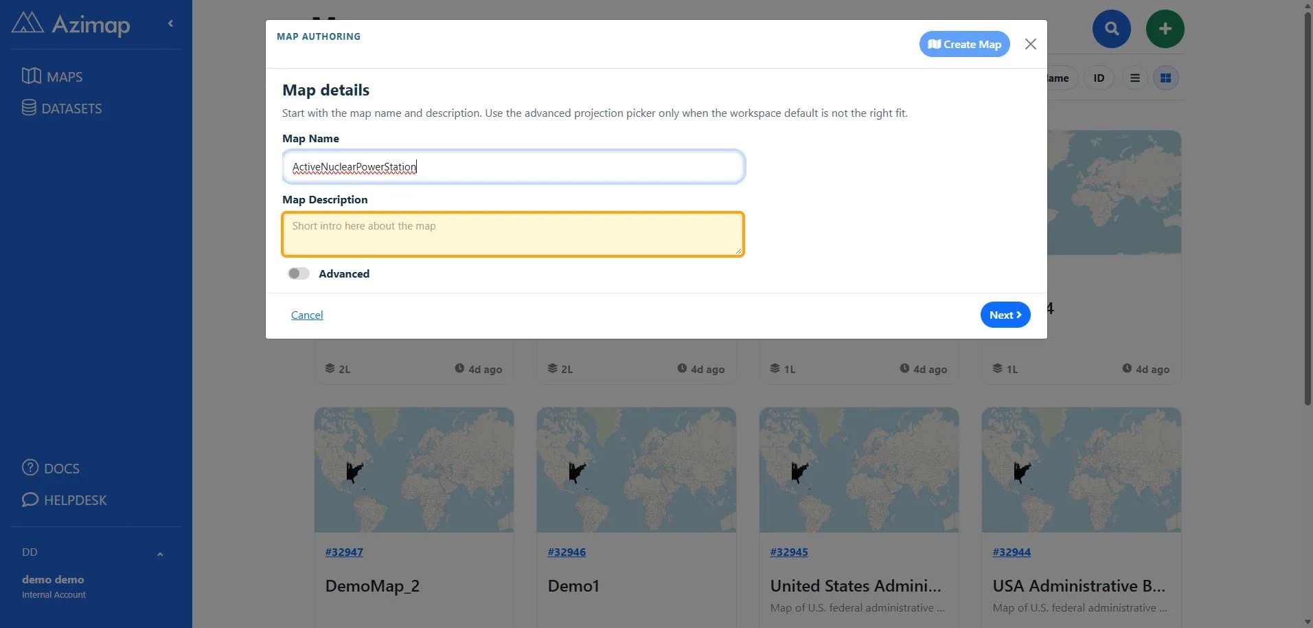
Enter a clear, descriptive map name. You can also add a short map introduction, then select Next.
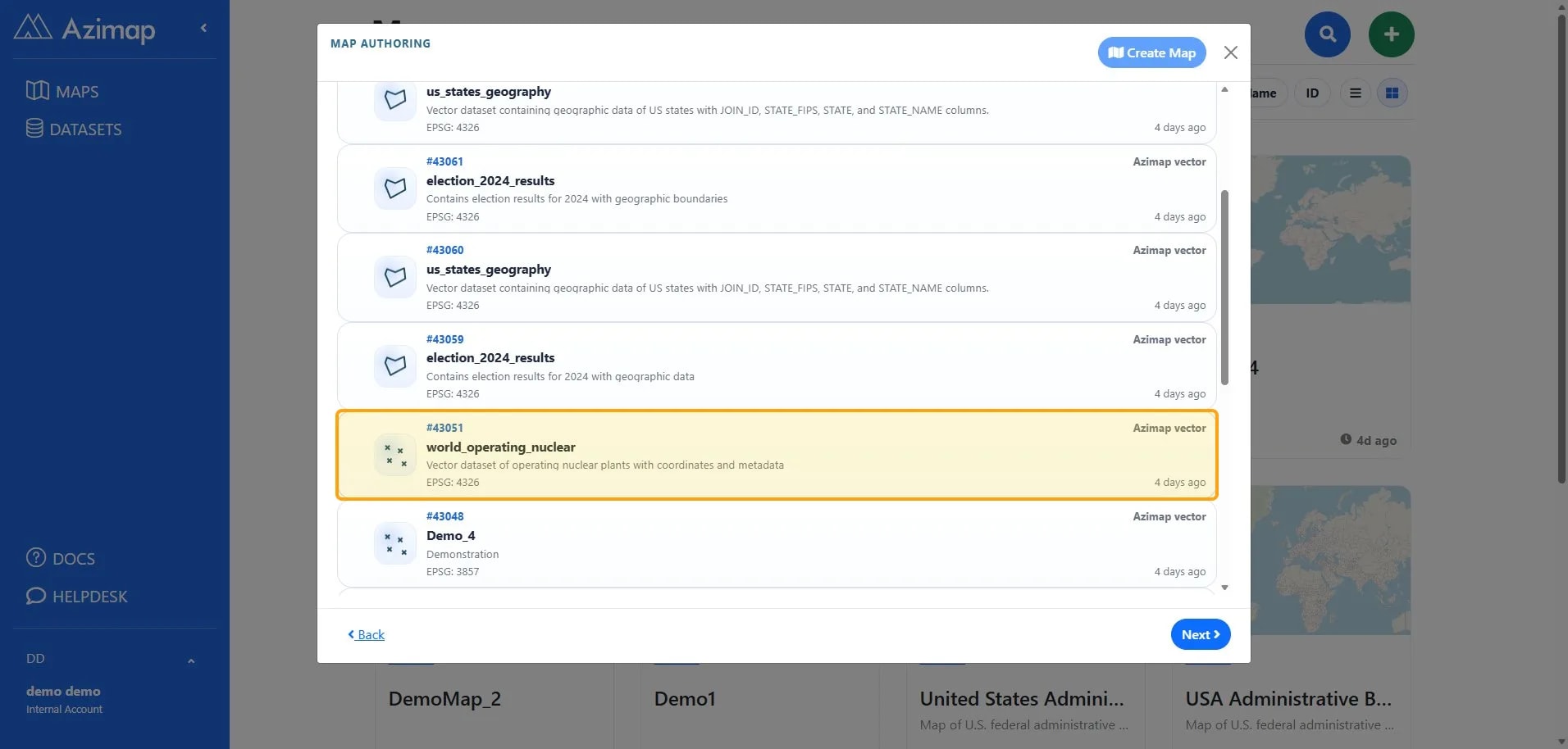
Choose the dataset that will supply the heatmap points.
Enable the Analysis and Edit Data optional module
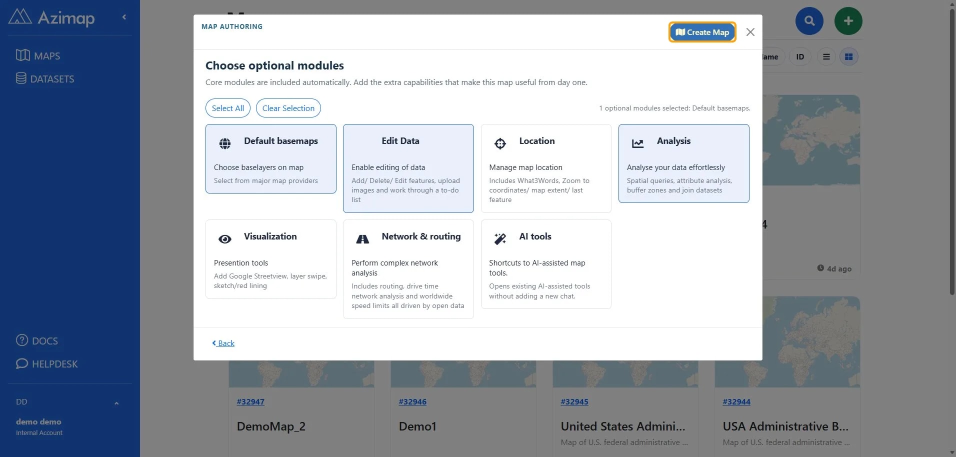
Select Create Map to finish the wizard.
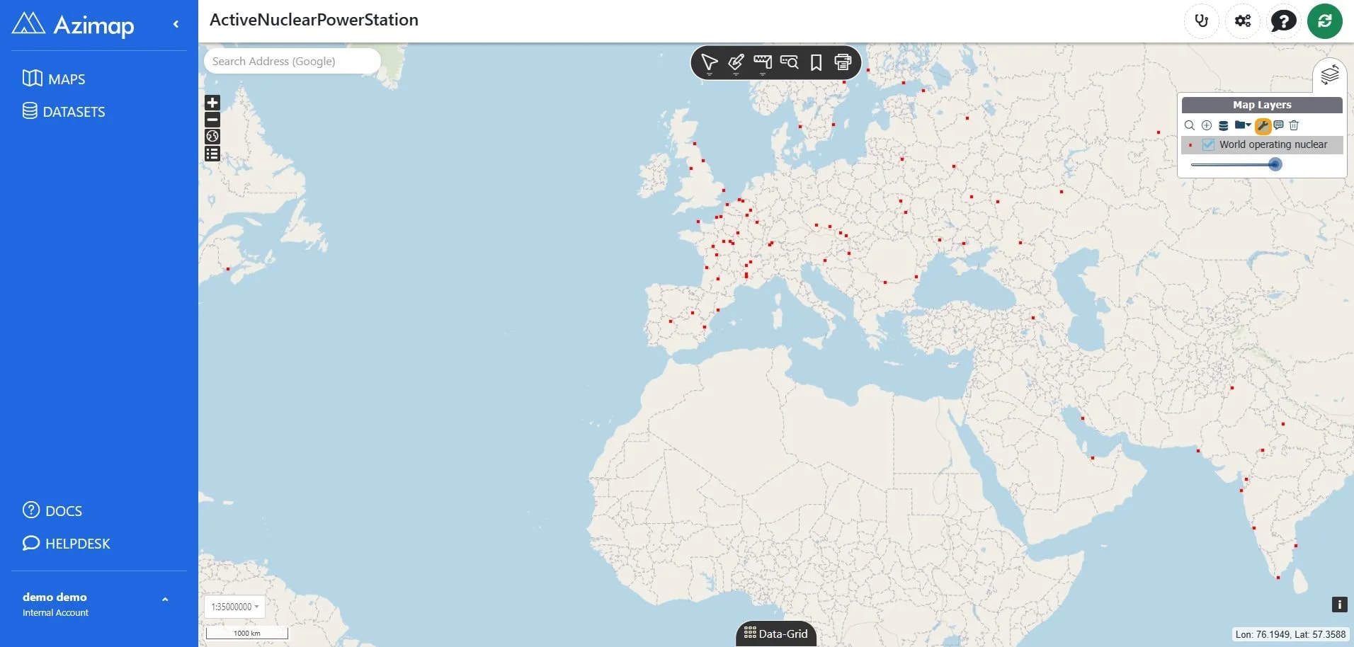
After successful import the map will load with the default styling (little red squares).
2. Create the Heatmap
Click on  in the map layer
tree view to open the styler. It is highlighted in the image below
in the map layer
tree view to open the styler. It is highlighted in the image below
(Each layer will have a small preview of its style
legend on its left - you can hover over it for a full legend view).
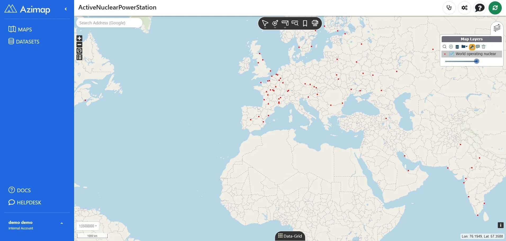
Click on output type and select "HEATMAP". Click SAVE CHANGES.
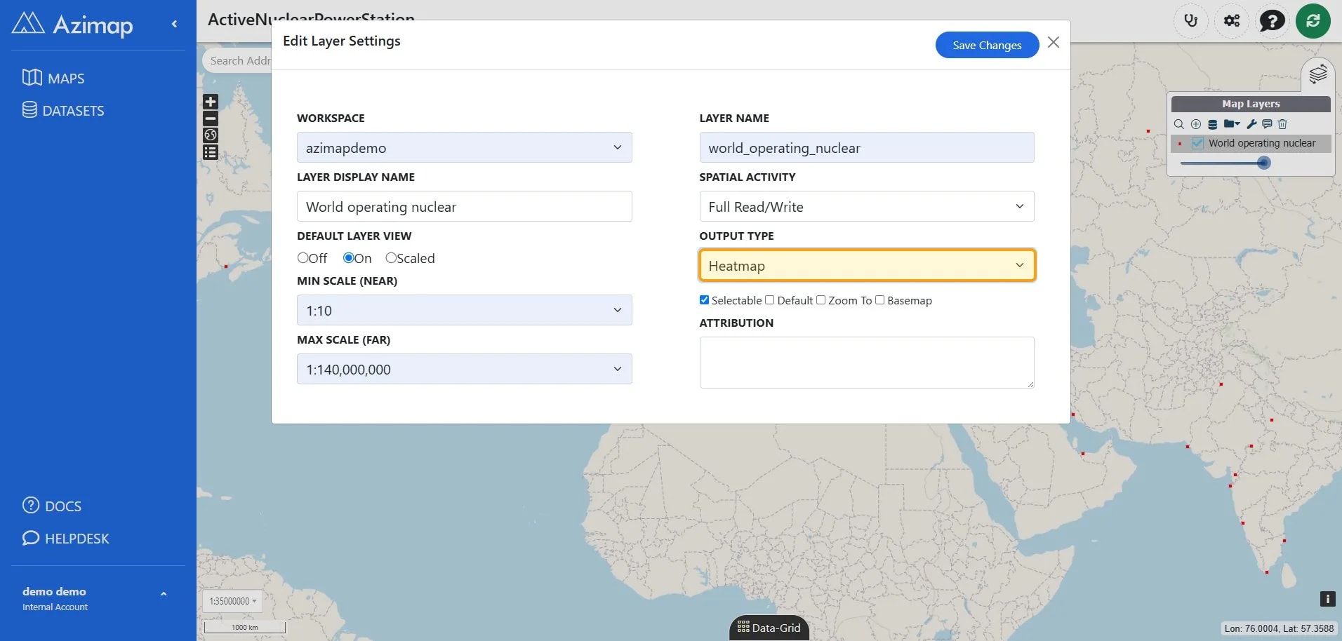
You will notice that the red dots that used to be on the map, have changed now to, red blue & green circles on the styler.
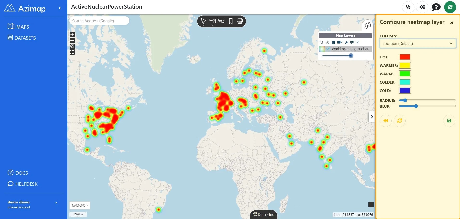
Double click on  this will open up a new side menu where we can apply rules to the heat map.
2.1. Apply heat map
rules
In the 'Heat Map Rules' window you can
have a few options:
- Set the opacity (transparency) for the heat map
- Choose the attribute of the data on which to style the heat map - For this dataset the best attribute to choose is 'Location' - this will highlight the worlds active nuclear power stations. Depending on the data that you have, you could ask it to create a heatmap highlighting the worlds powerful power station
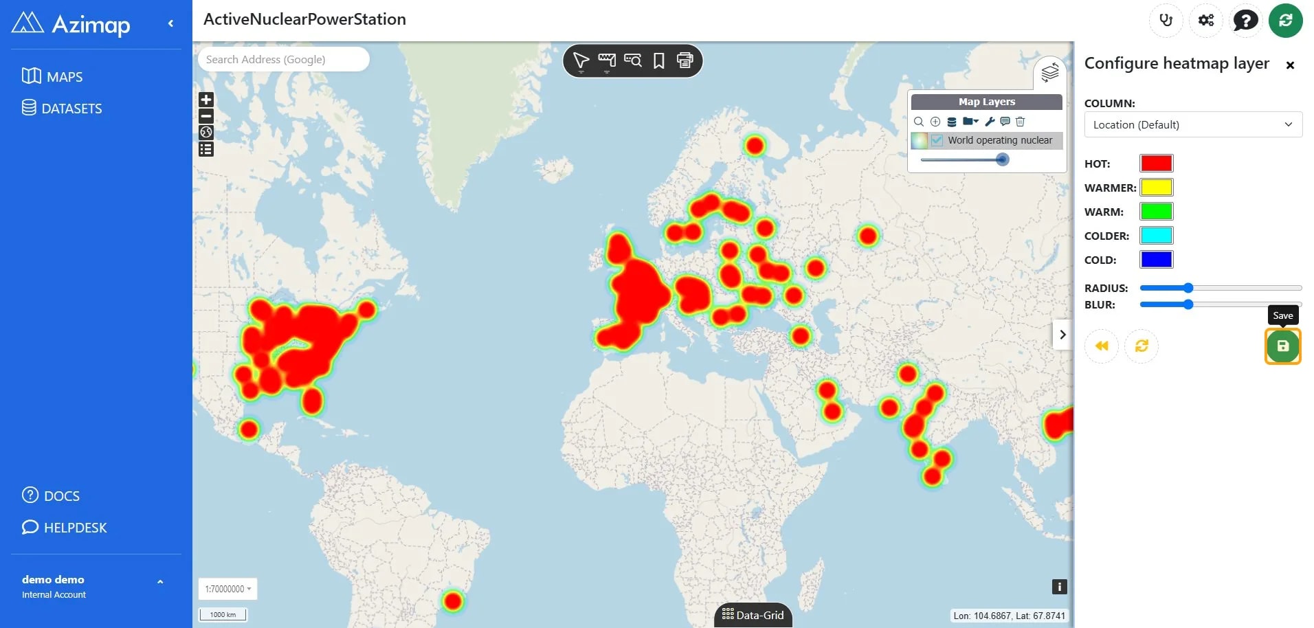
Select SAVE.
... enjoy your newly created heat
map!
Well done!
If you haven't
signed up yet go to the Azimap website and
click REGISTER.
US Nuclear Power Plants
Data source: U.S. Energy Information Administration (EIA) · Reuse: U.S. Government public-domain data · Attribution: Source: U.S. Energy Information Administration (June 2026). · View EIA source data
US County Boundaries
Data source: U.S. Census Bureau – 2025 Cartographic Boundary Files · Reuse: U.S. Government data; source citation recommended · View Census boundary data